The challenge
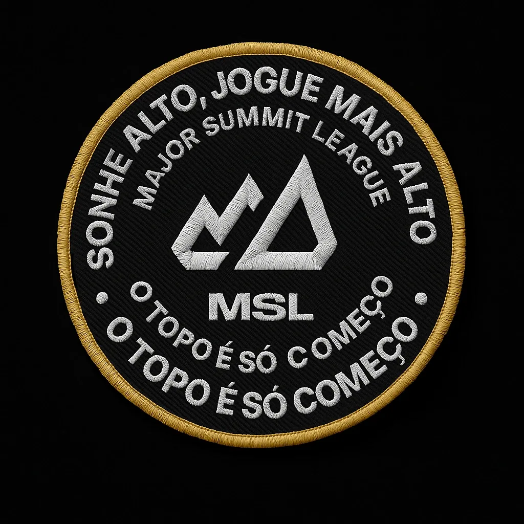
Create an original brand carrying the crown symbol, already overused in the scene, without falling into cliché. And make a black-and-gold palette stay legible on screens and even in embroidery.
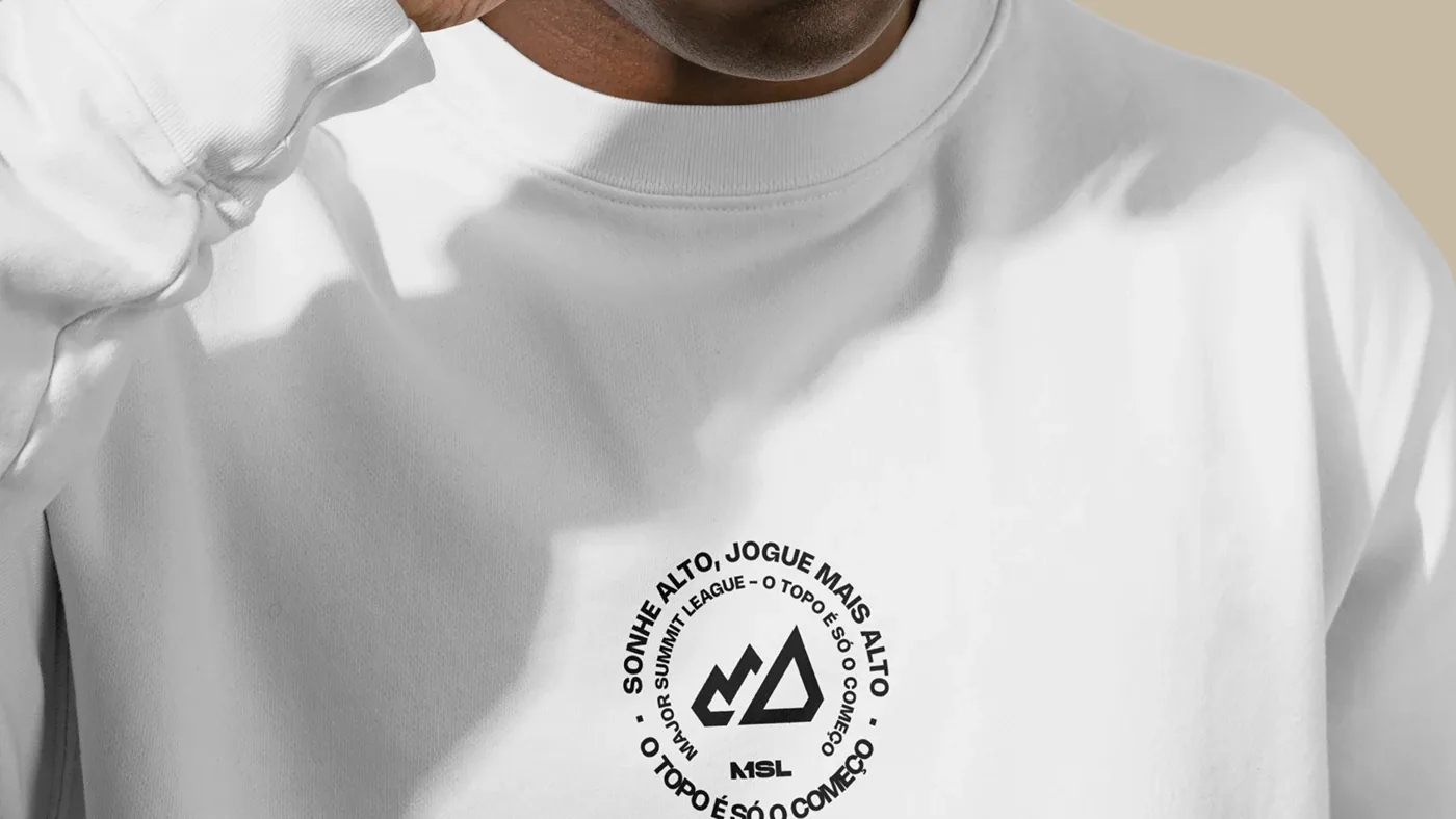
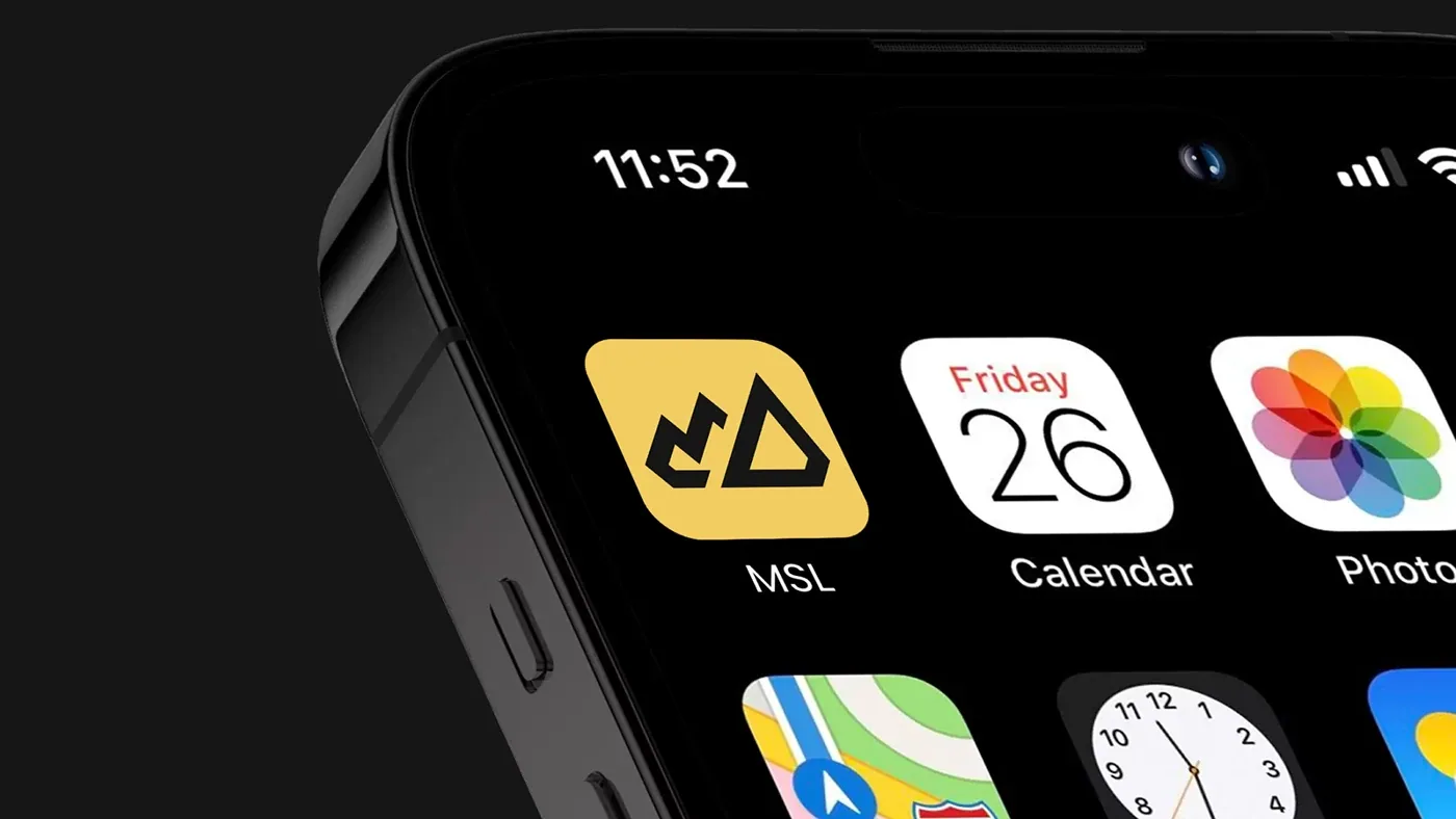
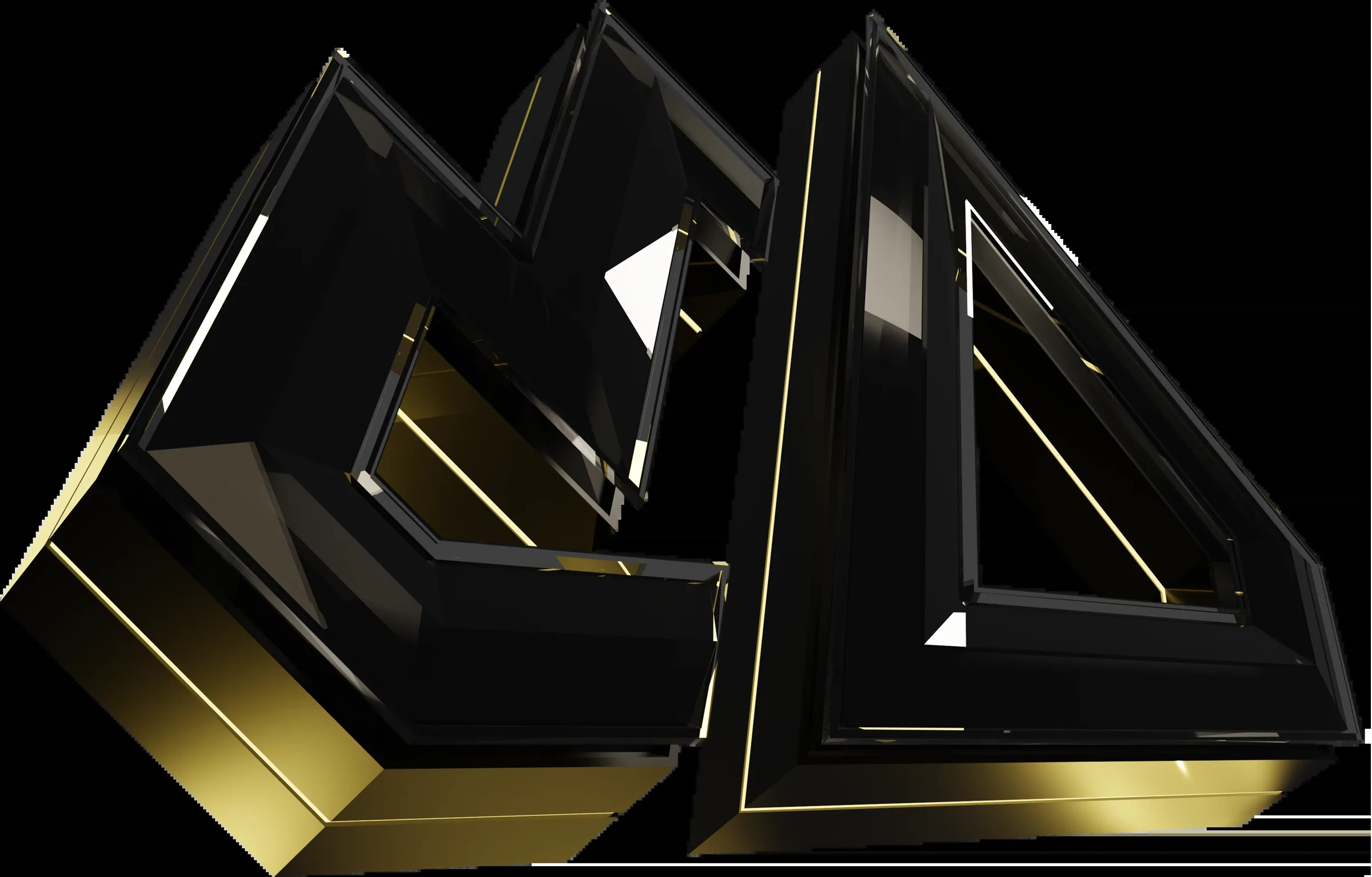
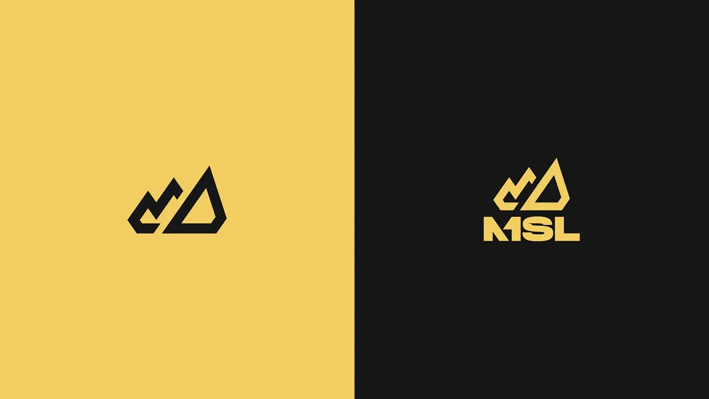
1icon: summit + crown + trajectory
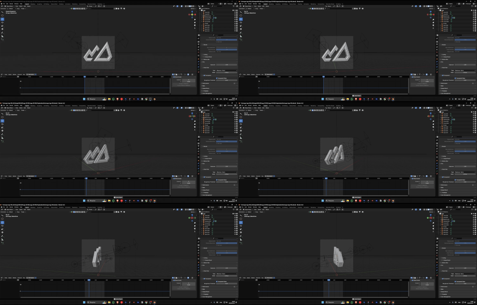
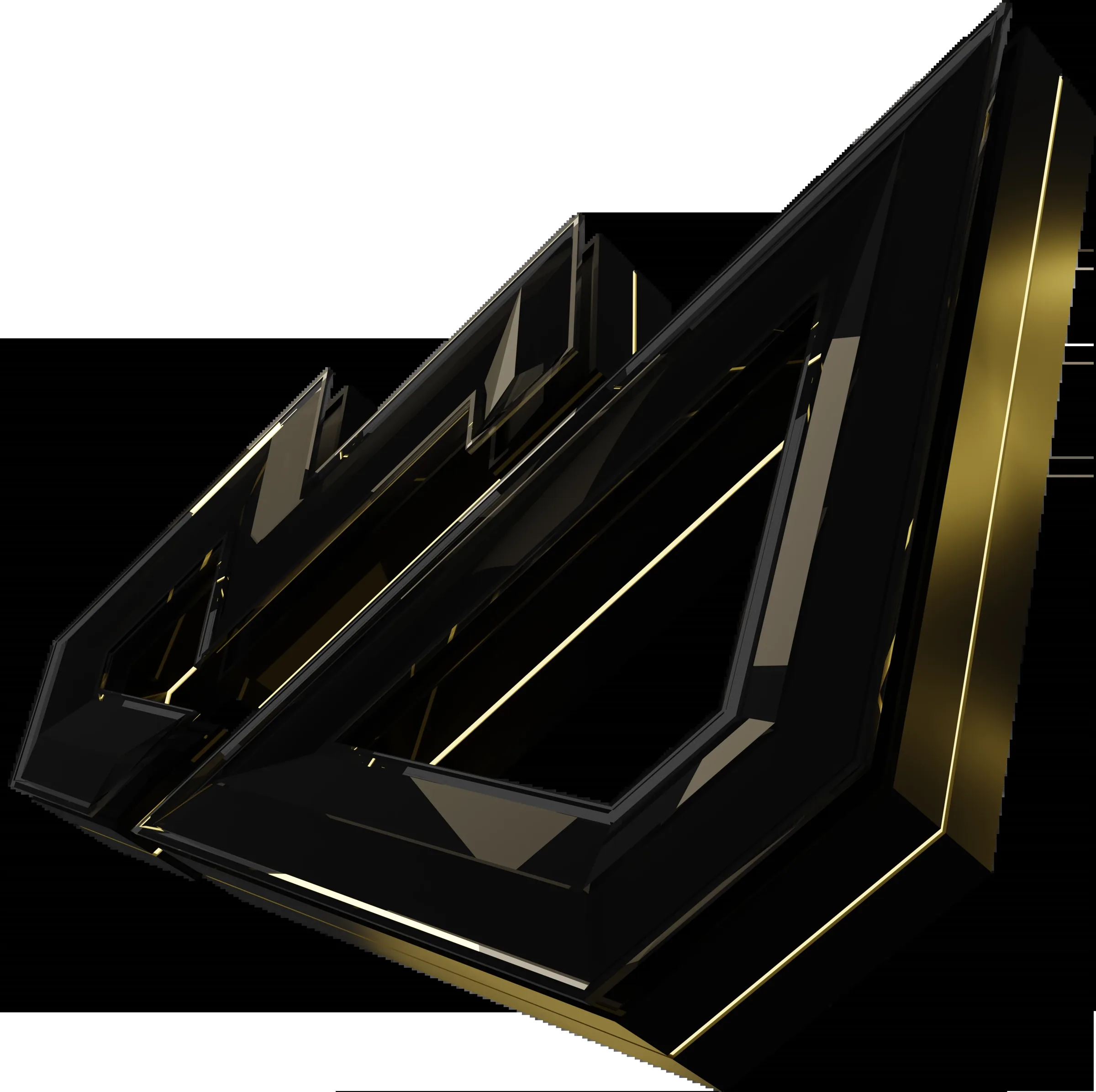
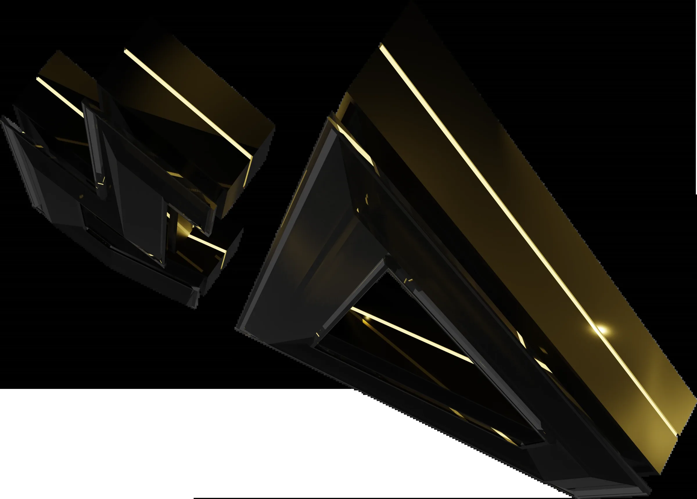
3Danimated logo for broadcast
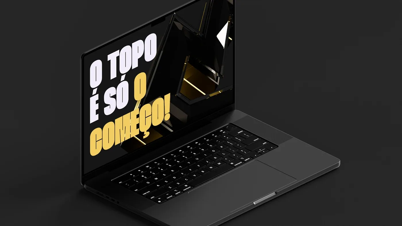
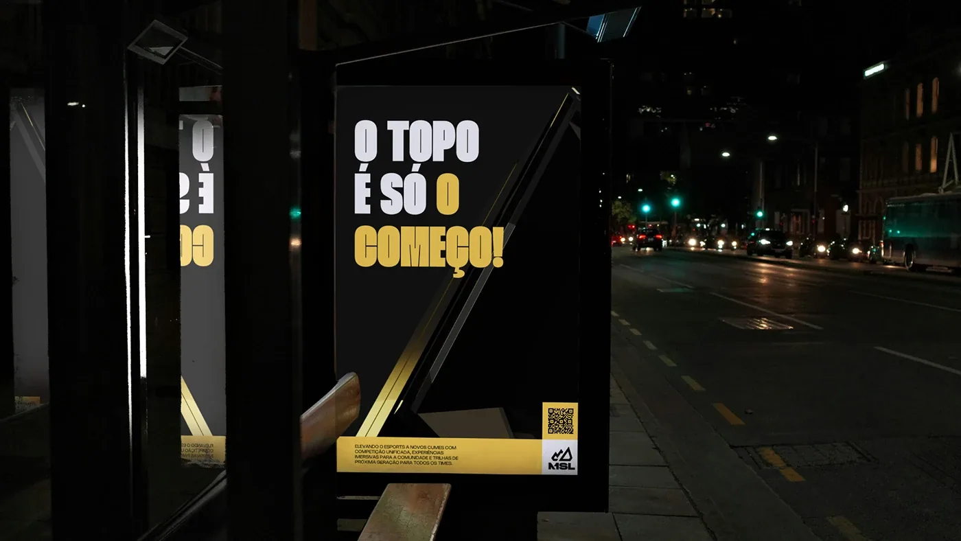
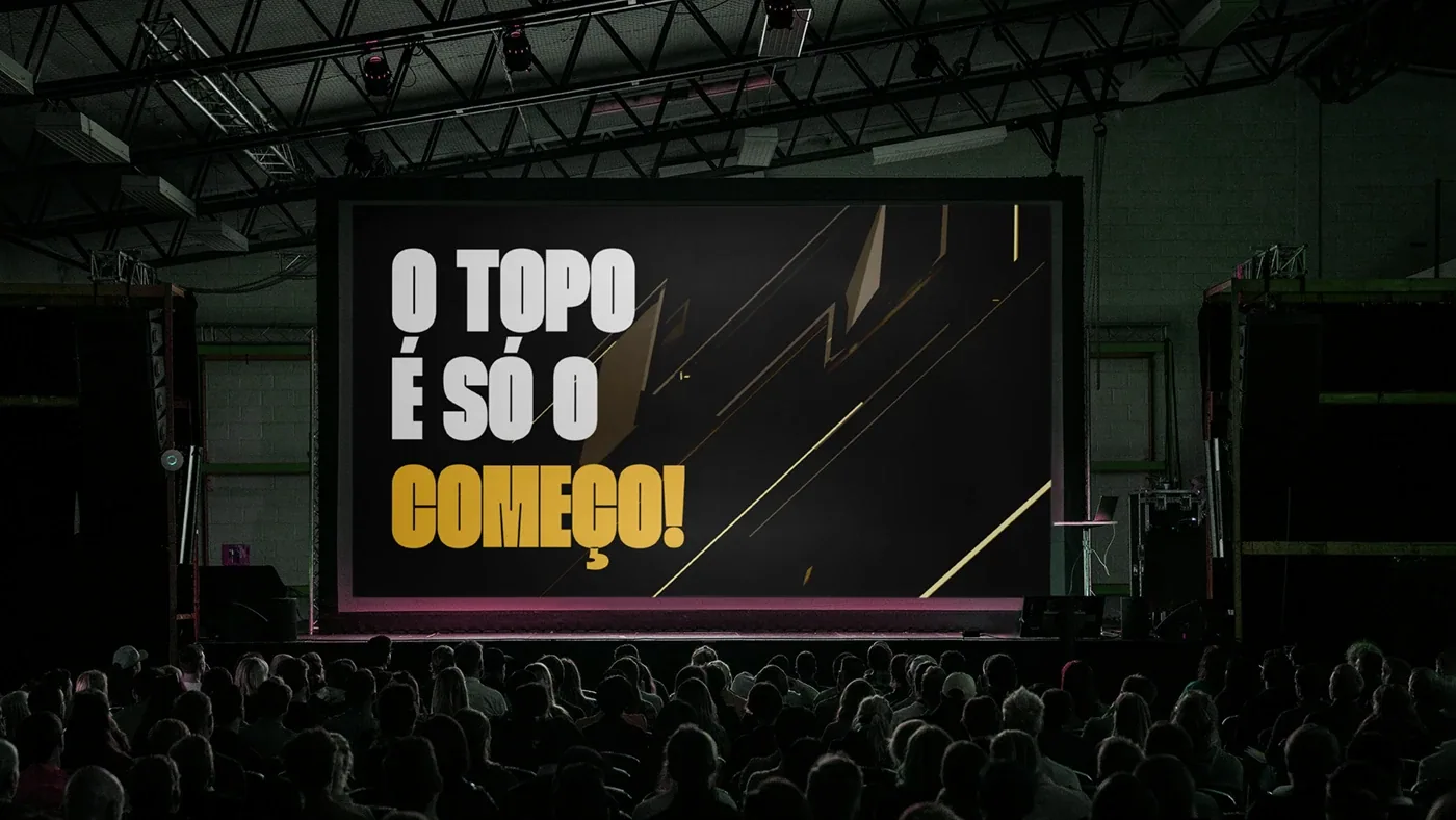
“O topo é só o começo”league tagline
How I did it
 01 / 05
- 01
Research
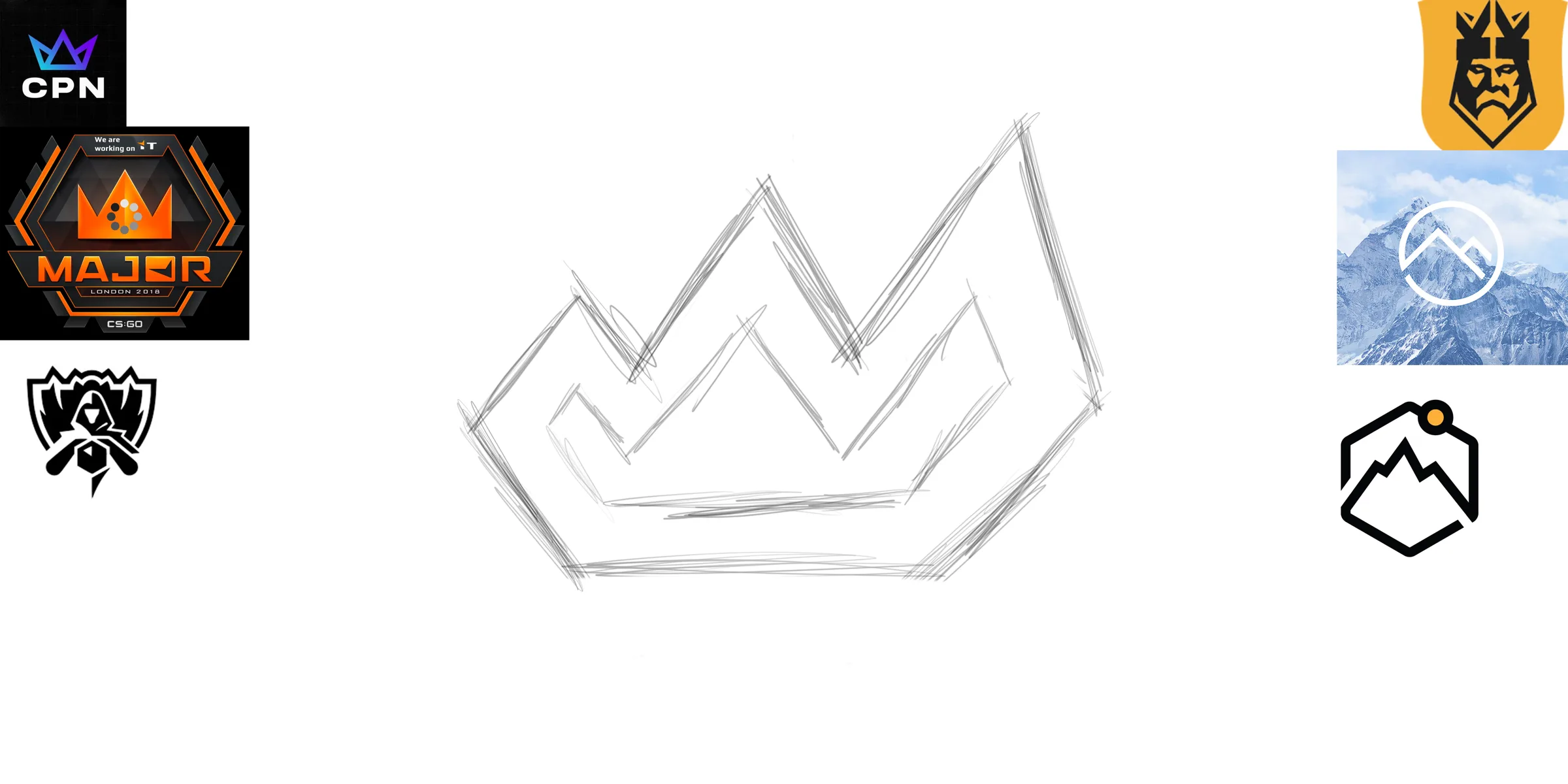
I mapped how the big leagues use the crown to avoid the obvious: the symbol had to speak about the top, not royalty.
- 02
The symbol
Mountain, crown and path became one geometric form. Simple enough to embroider, strong enough for an arena.
- 03
Color and type
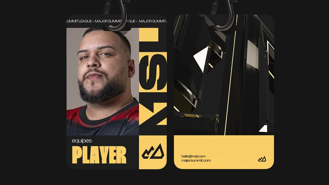
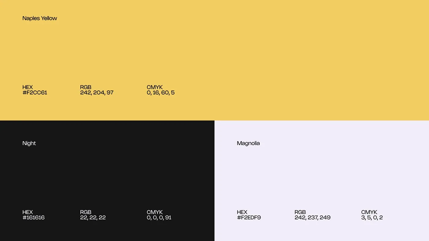
Black and gold with contrast tested on screen and fabric, Thunder for impact and Nohemi for reading.
- 04
3D and motion
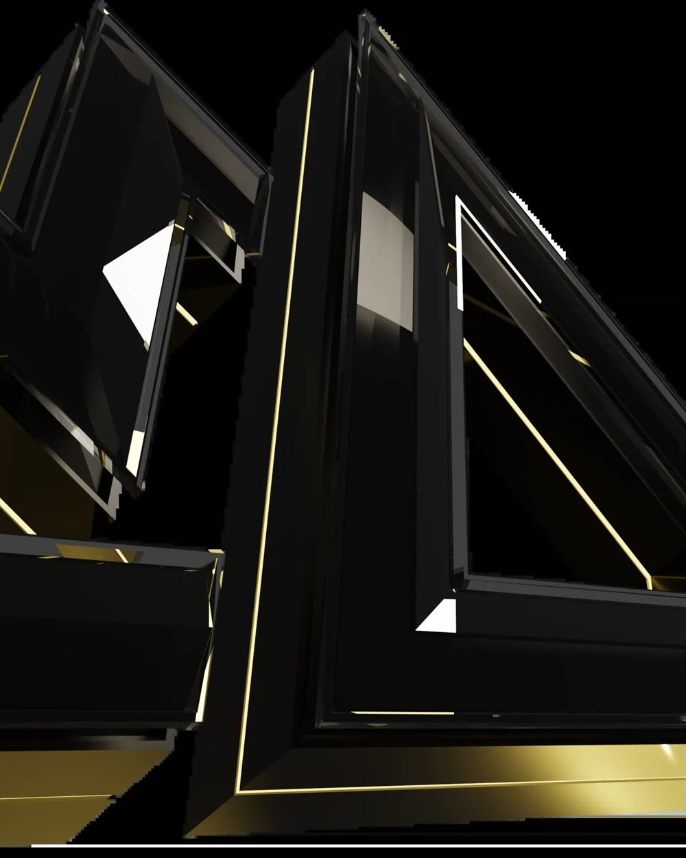
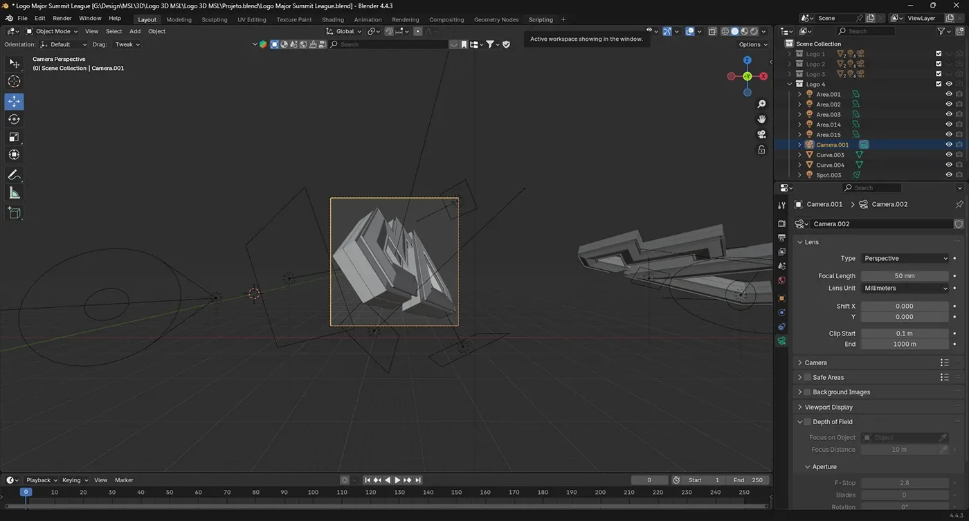
A 3D version modeled in Blender and animated for broadcast openers, keeping the same geometry as the 2D mark.
- 05
Applications
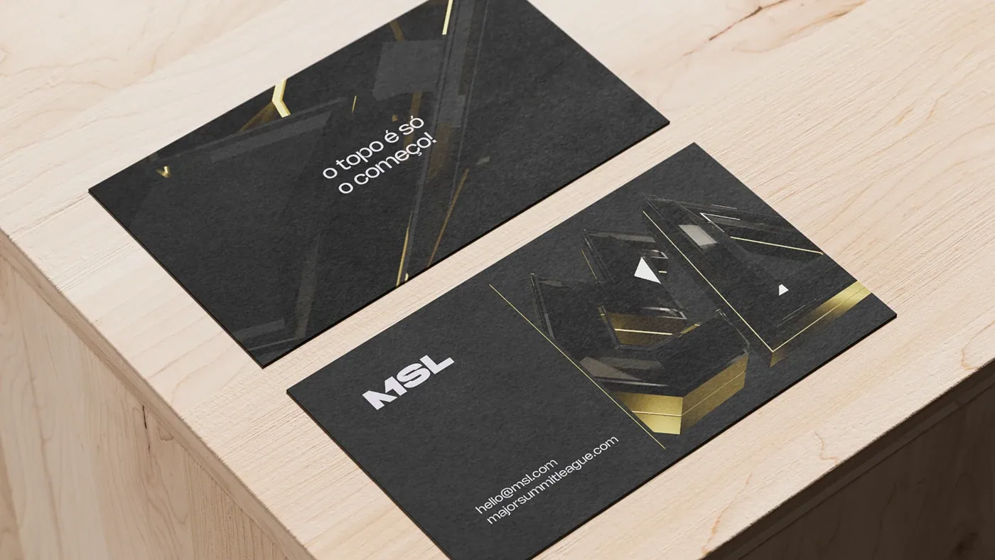
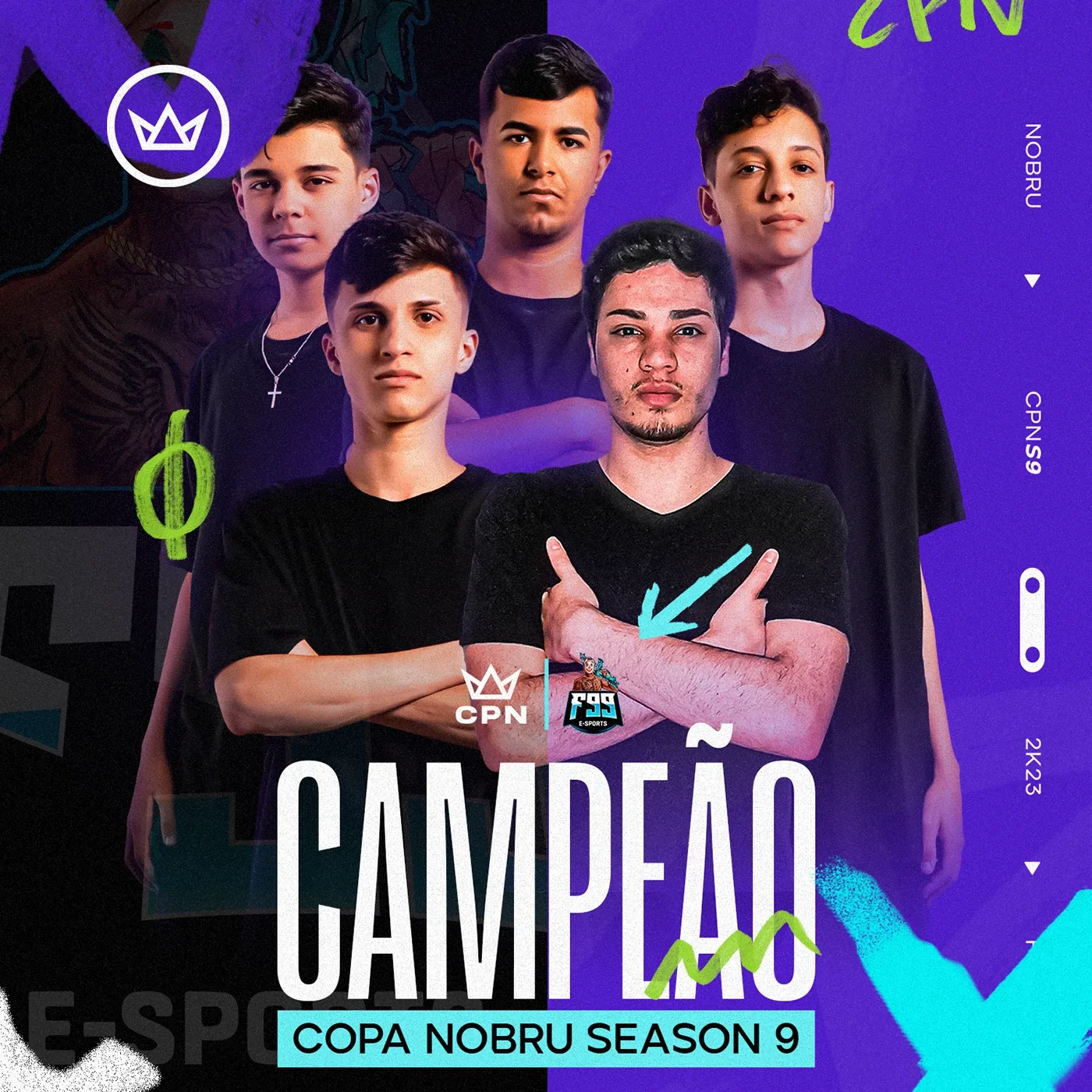
Jerseys, embroidered patch, credentials, outdoor media and stage screens. The brand on players and on stage.