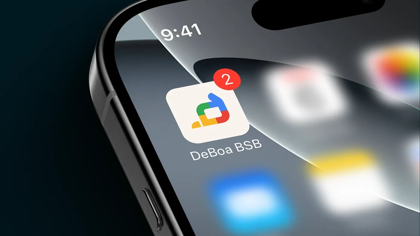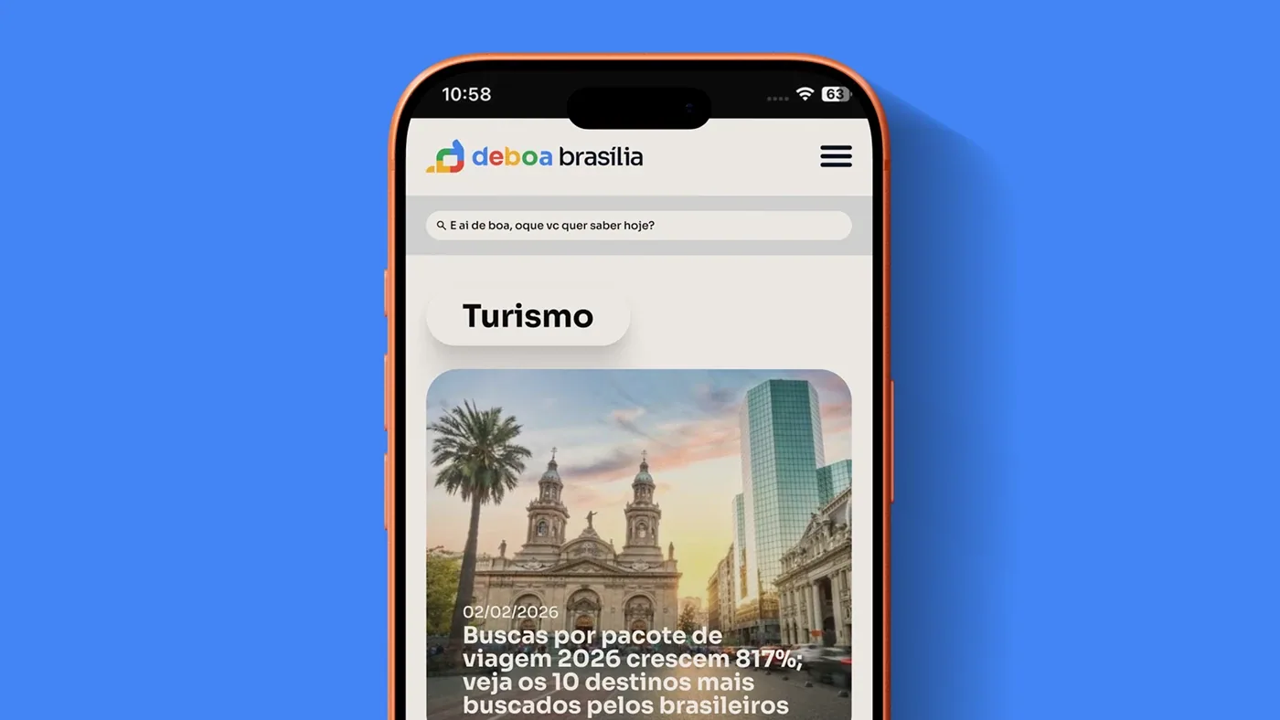

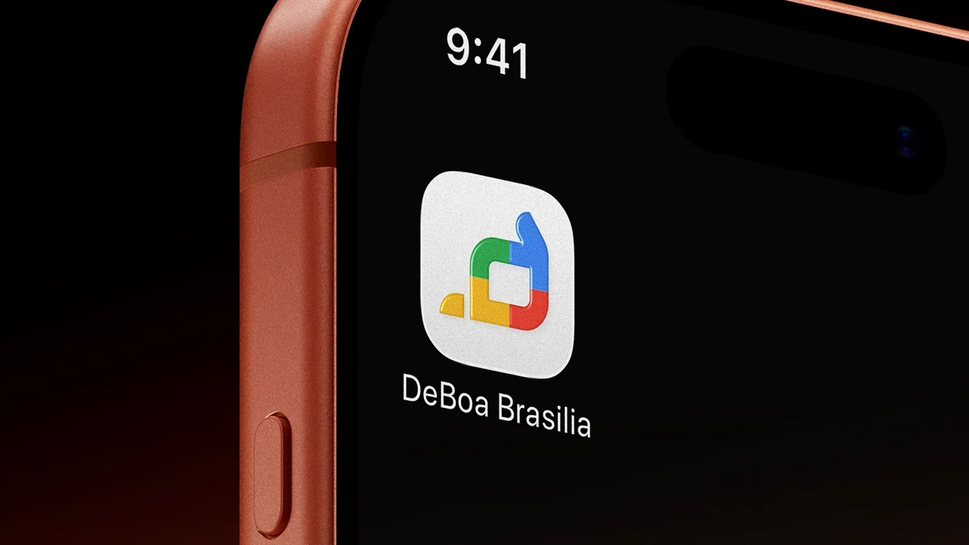
DeBoa arrived without a defined visual identity. It was an urban leisure and experiences business that wanted to be taken seriously, but it communicated like a hobby: a generic logo, random colors and no rules to grow into new channels.
How I did it
 01 / 05
- 01
Brand DNA
Before any visual: personality, tone of voice, archetypes and aesthetic territory. Design only came in once the brand knew who it was.
- 02
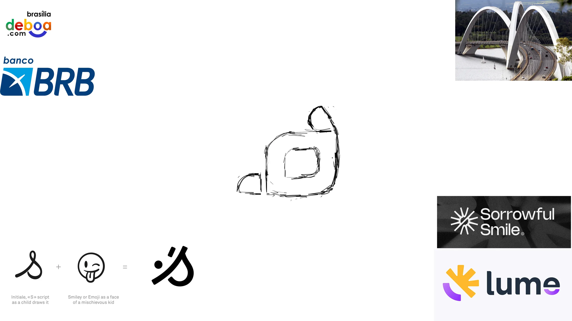
References and sketch
The symbol comes from Brasília's duality: the rigid urban plan and the energy of the people who live it. First on paper, then in vector.
- 03
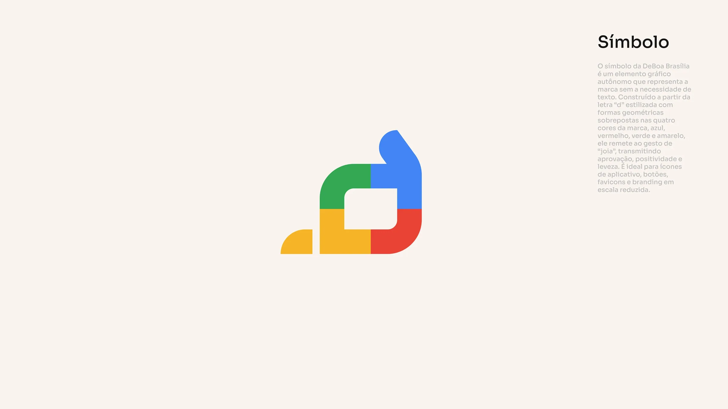
Symbol and logotype
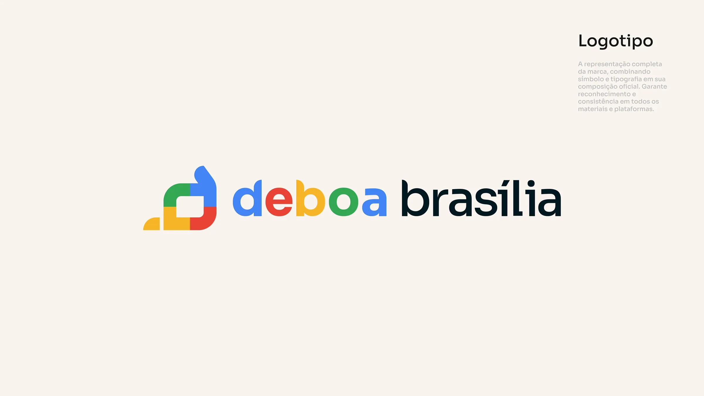
A colorful geometric icon that nods to modernist architecture without becoming a caricature, with clear space and versions for every use.
- 04
System and iconography
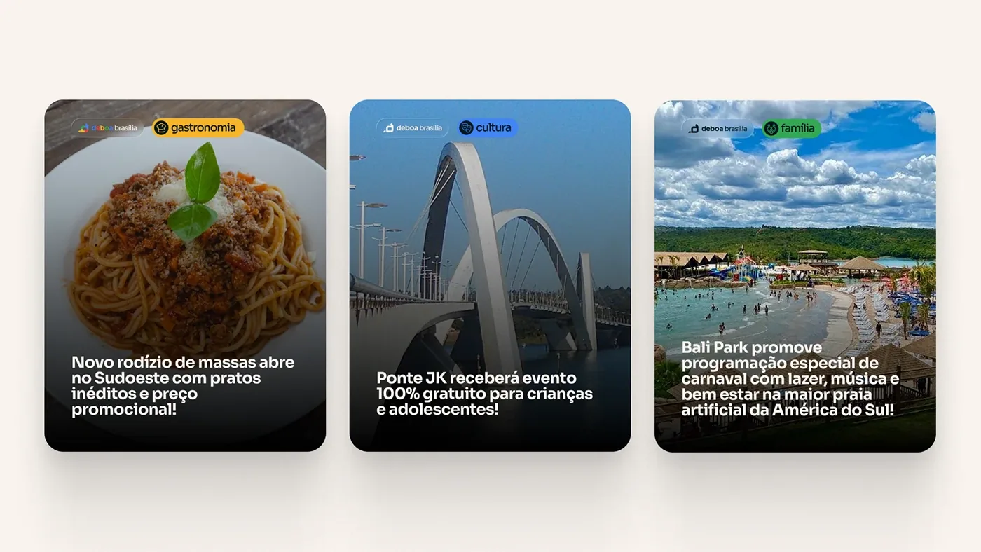
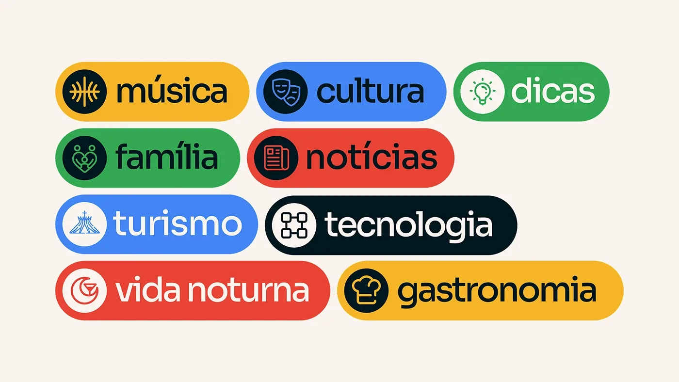
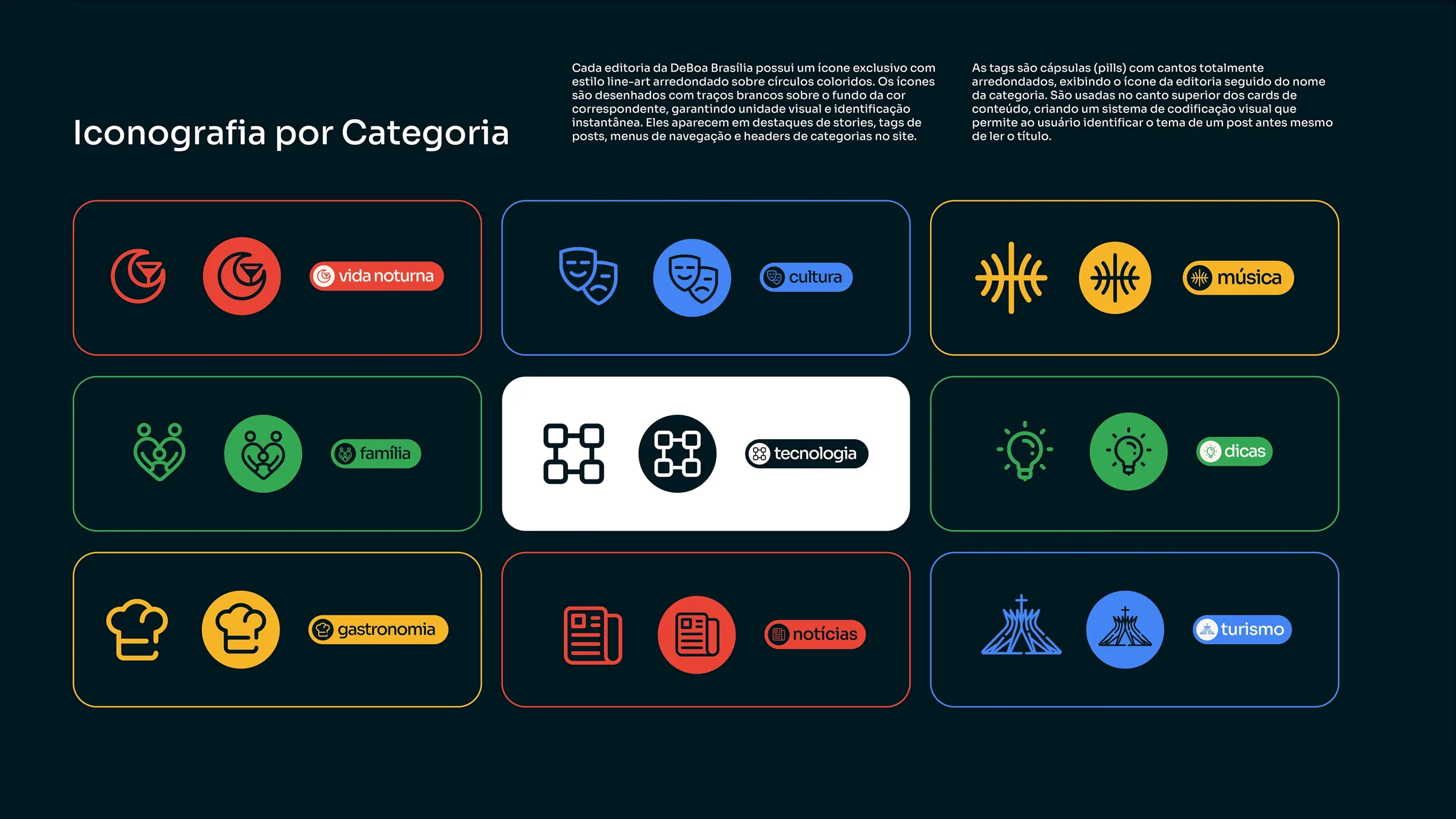
Typography with presence, a palette that balances formality and movement, and 9 categories with their own icon and color.
- 05
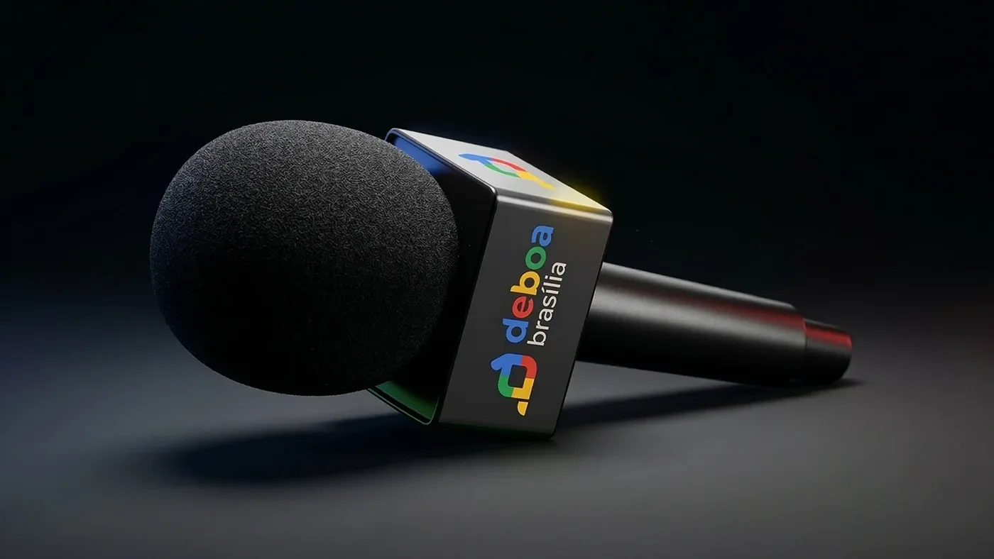
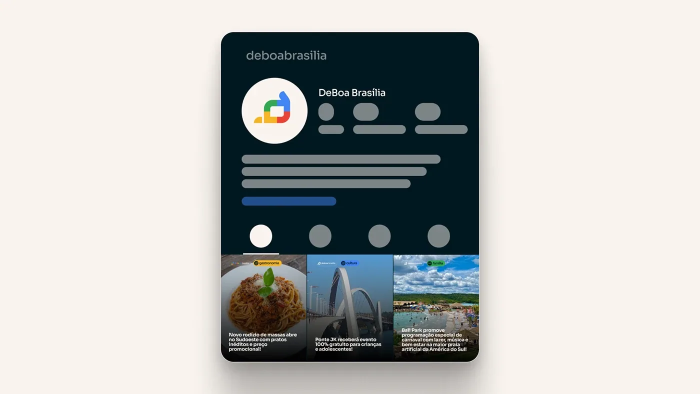
Applications
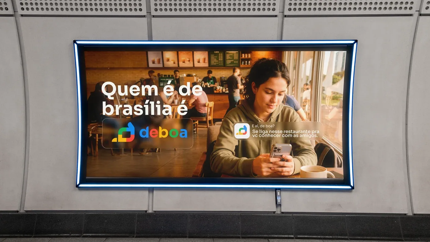
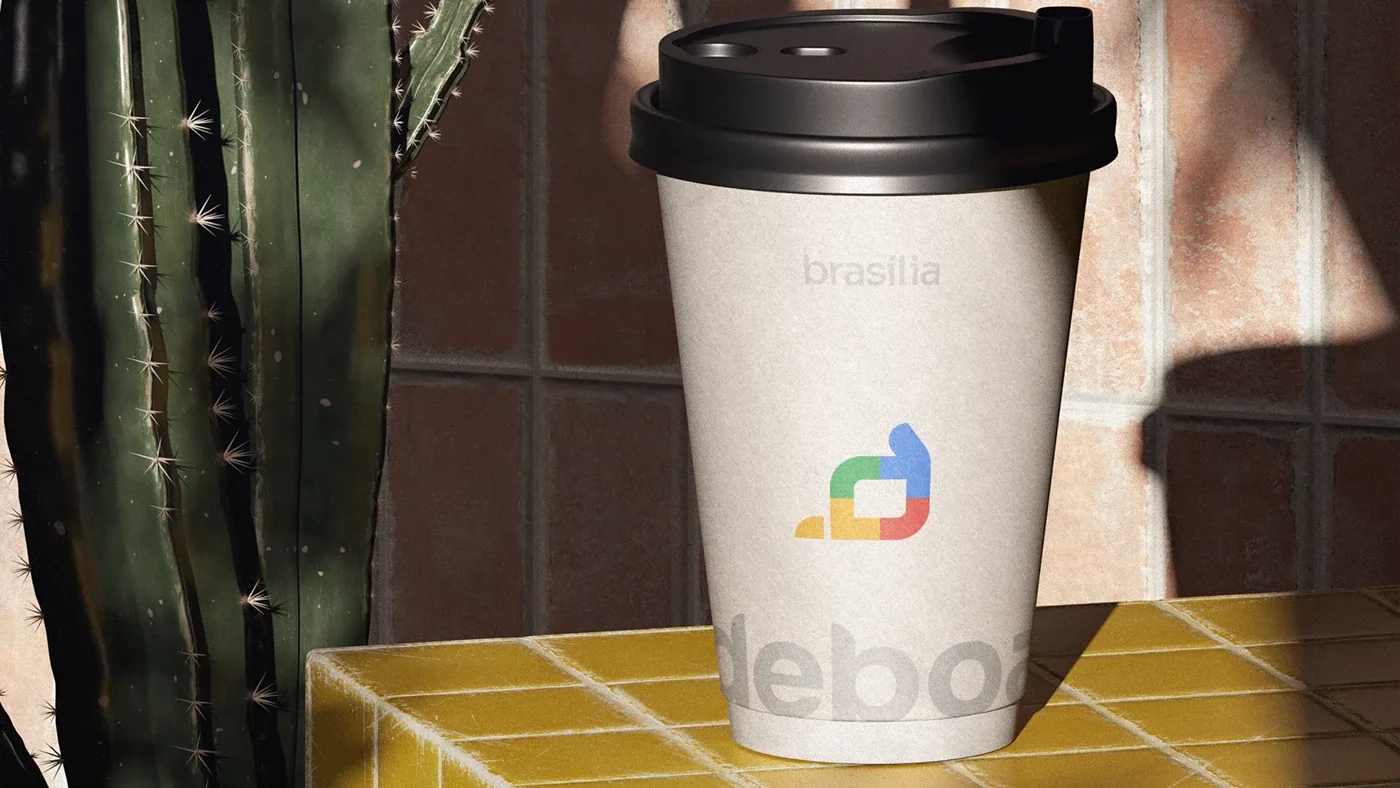
App, website, social, out-of-home media and merch. The brand tested in the real world before delivery.